Sections and Content Types
What is a section
Sections are used to group similar definitions in helpful categories. Creating and editing sections will only be available to org admins.
How to create a section
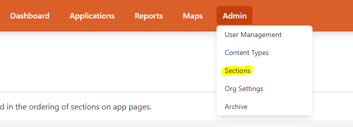
- Access the drop down page from admin navbar item and find sections
- In the sections page you can click the add button in the top right to add a new section. A popup will ask for the section name and description but only the section name is required to create a section.
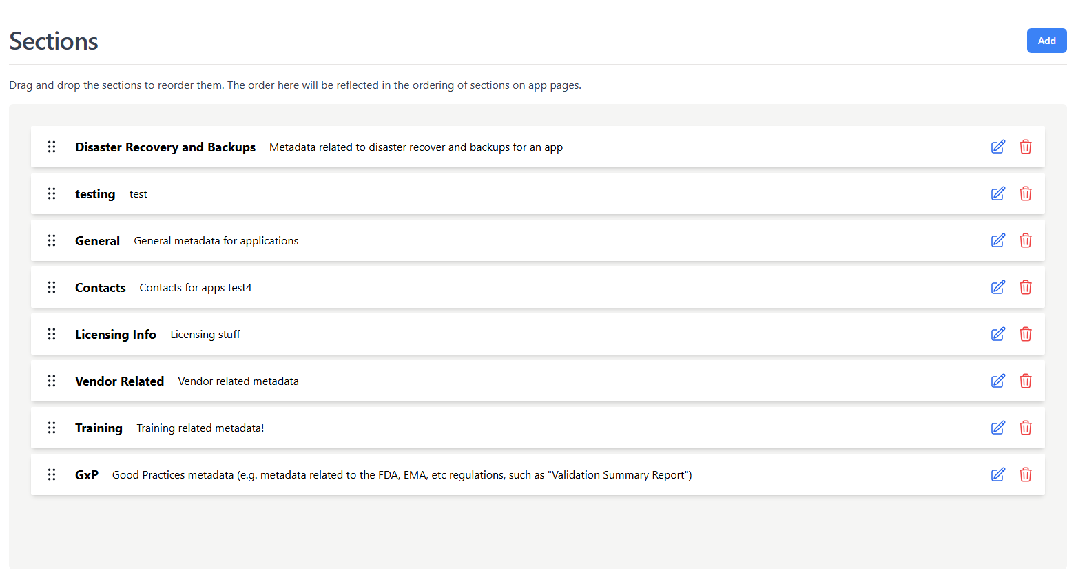
- On this page the org admin can also edit, delete, or reorder existing sections
Info
Sections can be dragged and dropped to change the order they show up in for the app page
What is a content type
Content Types are the building blocks for the apps page and used to store unique metadata for your application catalog
How to create a content type
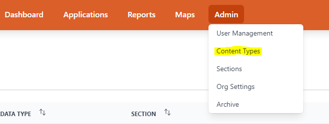
- Access the drop down page from Admin in the top navigation and find definitions
- After pressing the add button in the top right a form to enter the content type’s information pops up
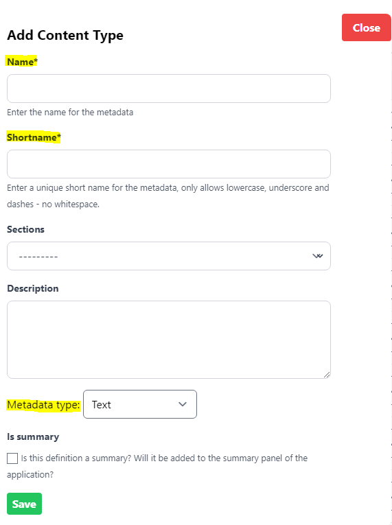
- Only the name, shortname, and metadata type are required
- The shortname must be unique to the org and lowercase with no whitespaces
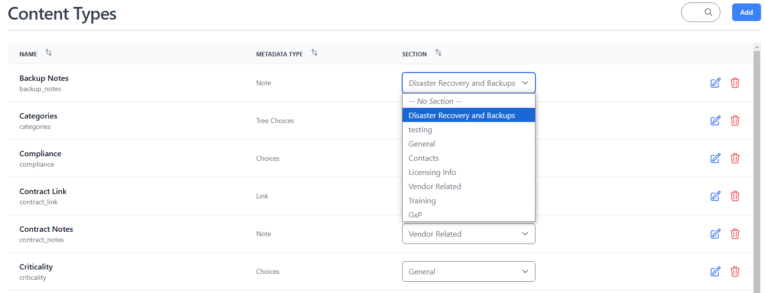
How to associate a content type with a section
- In the content types page use the section selection to associate the content type with a section
Setting content types as filters or summaries
Some metadata types can be set as filters or summaries this article will explain how to do so, which metadata types make sense for filters and summaries, and some examples.
- Content Types can be set as filters or summaries in the Content Types section when editing or creating a content type
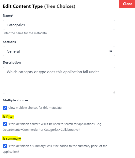
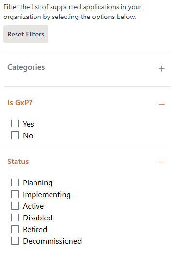
- The only metadata types choices and tree choices can be set as filters
- Some good examples being categories, departments, and application status
- The reason only choices and tree choices were selected is because they limit the number of unique options
- The definitions set as filters become the facets on the applications page
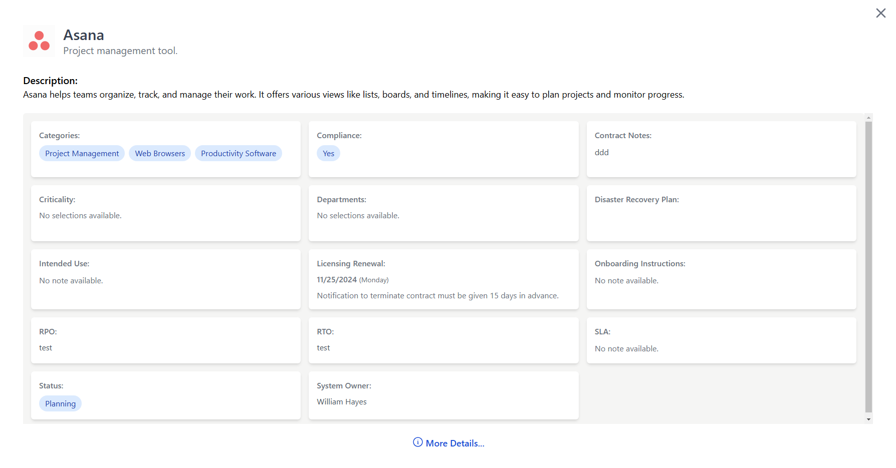
- All metadata types can be set as summaries but that does not mean all metadata types should be on the summary panel in the app page
- All metadata types have their normal view and a more condensed view - summary view
- The best definitions to set as summaries are any that you want members of your org to see quickly when they access the app page. e.g. business owner, support options, or status
Info
Only definitions with metadata types choices or tree choices can be set as a filter for the apps listing. The is summary option is available for all the metadata types and will show a summarized version of the definition in the app’s summary panel
Content type visibility
By default every content type is visible to all members of the org. If you want to restrict a content type so that only users with elevated roles can see it, you can change its Visibility setting in the Content Types table.
| Visibility | Who can see it |
|---|---|
| Everyone | All org members (default) |
| IT Admin & above | IT Admins, App Managers, and Org Admins |
| App Editor & above | App Managers and Org Admins |
| Org Admin only | Org Admins only |
To change visibility, use the Visibility dropdown in the Content Types list. Changes take effect immediately.
If a section contains only restricted content types, the section header will automatically be hidden from users who do not have the required role.
Info
The IT Admin role is a new role designed for users who need to see sensitive operational data (such as IT Admin notes) without having full App Manager or Org Admin privileges. See User Permissions for details.
Note content type
The Note content type is a rich text editor suited for longer, formatted content such as onboarding instructions, operational procedures, vendor notes, or any free-form documentation attached to an application.
Toolbar
The editor toolbar provides the following formatting options:
| Button | Description |
|---|---|
| Paragraph / Headings (H1–H3) | Set the text style for the current block |
| Bullet list | Unordered list |
| Ordered list | Numbered list |
| Blockquote | Indented quote block |
| Horizontal rule | Visual divider line |
| B Bold | Bold text |
| I Italic | Italic text |
| U Underline | Underlined text |
| ~~S~~ Strikethrough | Struck-through text |
| Link | Insert or edit a hyperlink (supports opening in a new tab) |
| Undo / Redo | Step backwards or forwards through your edits |
Code blocks
Code blocks (for command-line snippets, config examples, etc.) are supported but do not have a toolbar button. Use the keyboard shortcut instead:
- Mac:
Cmd + Option + C - Windows / Linux:
Ctrl + Alt + C
This toggles the current paragraph in and out of a code block. To exit a code block, press the shortcut again or press Enter twice at the end of the block.
Tips
- Use Headings to break long notes into scannable sections.
- Use a Code block for any commands or configuration that users should copy exactly.
- The Visibility setting on the content type controls who can read the note — pair a restricted Note (e.g. "IT Admin only") with a visibility level to keep sensitive information out of the general view.
- Notes are included in the Markdown export available via the API, so well-structured notes improve the quality of LLM-assisted portfolio queries.